Insights
Accessible UI design guide: practical steps for product teams
Learn how to design accessible UI that meets WCAG 2.2 Level AA. Practical steps, tools, and testing strategies for product managers and UX designers.
!Designer reviewing UI accessibility notes at desk

Most tech products ship with accessibility gaps that quietly push users away. Over one billion people worldwide live with some form of disability, and when your interface fails them, you lose real users and real revenue. WCAG 2.2 is the established standard for accessible UI design, organized around four core principles that every product team should know. This guide gives you the standards, tools, and step-by-step process to reach Level AA compliance without slowing your roadmap. Whether you're building a SaaS dashboard or a fintech onboarding flow, these steps apply directly to your work.
Table of Contents
- Understand accessibility standards and requirements
- Preparation and tools: Setting up for accessible UI
- Step-by-step: Designing accessible UI components
- Troubleshooting and handling accessibility edge cases
- Verification: Testing accessibility and measuring results
- A fresh perspective on accessible UI design for tech teams
- Take your product's accessibility to the next level
- Frequently asked questions
Key Takeaways
| Point | Details |
|---|---|
| Follow WCAG 2.2 AA | WCAG 2.2 Level AA is the best practice baseline for accessible UI in digital products. |
| Manual testing is essential | Automated tools alone miss over half of accessibility issues, so manual methods are critical. |
| Design for edge cases | Plan for extremes like one-handed use and low vision to ensure true accessibility. |
| Accessibility as innovation | Accessible design helps products outperform competitors by serving more users. |
Understand accessibility standards and requirements
Before writing a single line of CSS, your team needs a shared understanding of what accessibility actually requires. Vague intentions don't ship accessible products. Clear standards do.
WCAG 2.2 organizes accessibility requirements around four principles, known as POUR:
- Perceivable: Users must be able to perceive all information, including text alternatives for images and captions for video.
- Operable: All functionality must work via keyboard, not just a mouse.
- Understandable: Content and UI behavior must be predictable and easy to interpret.
- Robust: Your code must work reliably across assistive technologies like screen readers.
These four principles aren't abstract. They map directly to design decisions you make every sprint.
WCAG 2.2 has three compliance levels. Level A covers the bare minimum. Level AAA is the gold standard, often impractical for most products. Level AA is the sweet spot and the legal benchmark in many jurisdictions, including the EU and the US under Section 508. For most growth-stage product teams, targeting AA is both realistic and sufficient.
!Infographic comparing accessibility compliance levels
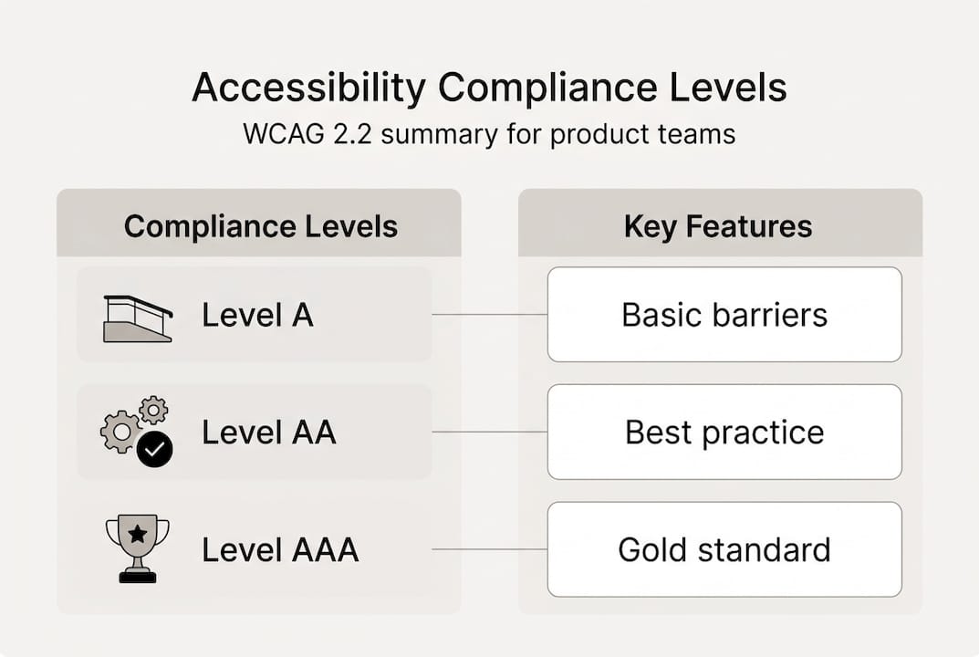
Here's a quick breakdown of what each level covers:
| Compliance level | What it covers | Practical relevance |
|---|---|---|
| Level A | Basic accessibility barriers | Minimum baseline, rarely enough |
| Level AA | Contrast, navigation, labels, errors | Legal standard for most products |
| Level AAA | Enhanced language, sign language, no time limits | Aspirational, context-specific |
One common misconception is that accessibility only matters for blind users. In reality, it benefits users with motor impairments, cognitive differences, situational limitations (like a broken arm), and aging users. Another misconception is that accessibility is a one-time audit. It's an ongoing design practice, not a checkbox.
If you want to see how real products handle these requirements, the UX accessibility case studies at Bitrupt Design show how teams translate standards into shipped interfaces.
Preparation and tools: Setting up for accessible UI
With the standards clear, the next step is prepping your environment and choosing the right tools.
No single tool catches everything. The most effective teams combine automated scanners with manual testing. Here's a comparison of the most commonly used tools:
| Tool | Type | Best for |
|---|---|---|
| Axe DevTools | Automated | Browser-based issue detection |
| NVDA / VoiceOver | Manual (screen reader) | Real user simulation |
| Colour Contrast Analyser | Manual | Checking text and UI contrast ratios |
| Lighthouse | Automated | Quick scoring and audits |
| Keyboard only navigation | Manual | Testing tab order and focus states |
Automated tools are fast, but they miss context. A tool can confirm that an image has alt text, but it can't tell you if that alt text is actually useful. Manual testing fills that gap.
A solid starting checklist, drawn from W3C accessibility design tips, includes these steps:
- Run a contrast check on all text and interactive elements
- Test full keyboard navigation through every user flow
- Run a screen reader scan (NVDA on Windows, VoiceOver on Mac/iOS)
- Zoom to 200% and confirm no content breaks or disappears
- Verify semantic structure with a heading outline tool
- Check that all form inputs have visible, associated labels
- Confirm skip links exist for keyboard users to bypass navigation
For device setup, test on both desktop and mobile. Use iOS Accessibility settings and Android TalkBack to simulate real assistive technology environments. Don't rely on emulators alone; test on actual devices when possible.
!Developer performing accessibility tests on multiple devices

You can find additional UI accessibility best practices that cover environment setup for teams working across multiple platforms.
Pro Tip: Start manual accessibility checks during wireframing, not just before launch. Catching a keyboard trap in a prototype takes minutes. Fixing it in production takes days.
Step-by-step: Designing accessible UI components
Once you have your tools ready, it's time to implement UI accessibility in practice.
Follow this sequence when designing or auditing any UI component:
1. Set contrast ratios first. Normal text needs a 4.5:1 contrast ratio against its background. Large text (18px+ or 14px bold) needs 3:1. Use a contrast checker before finalizing any color palette. 2. Never use color as the only signal. If your error state is just red text, users with color blindness miss it. Add an icon, a label, or a border change alongside color. 3. Use semantic HTML before reaching for ARIA. A native "<button>` element is keyboard accessible and screen-reader friendly by default. A `<div>` styled to look like a button is not. ARIA (Accessible Rich Internet Applications) is powerful, but it should supplement native HTML, not replace it. 4. Make focus states visible. Every interactive element needs a clear focus indicator. The default browser outline is often removed by CSS resets. Always add a custom, visible focus style. 5. Label every form field explicitly. Use `<label>` elements tied to inputs via `for` and `id` attributes. Placeholder text is not a label. It disappears when users start typing, leaving them without context. 6. Write descriptive error messages. Don't just mark a field red. Tell users what went wrong and how to fix it. "Email address is required" beats a generic alert icon. 7. Test ARIA roles carefully. Misusing ARIA creates more problems than it solves. Only add `role`, `aria-label`, or `aria-live` when native HTML can't do the job.
For a practical look at how these principles apply to real form design, see accessible UI forms and accessibility design examples from live projects.
Pro Tip: If you catch yourself wrapping a click handler around a `<div>`, stop. Use a `<button>`. It's keyboard accessible, focusable, and readable by screen readers without a single extra line of ARIA.
Troubleshooting and handling accessibility edge cases
Even with good fundamentals, unexpected accessibility issues often arise. Here's how to handle them.
Some of the trickiest accessibility edge cases include keyboard traps in modals, color-only information, touch targets under 44px, flashing content, improper focus management, and ARIA anti-patterns. These don't show up in basic audits but they break the experience for real users.
Here's a breakdown of common edge cases and how to fix them:
- Keyboard traps in modals: When a modal opens, focus must move into it and stay there until the user closes it. When it closes, focus must return to the trigger element. Without this, keyboard users get lost.
- Small touch targets: Buttons and links under 44x44 pixels are hard to tap accurately, especially for users with motor impairments or tremors. Apple's Human Interface Guidelines and WCAG both recommend a minimum of 44px.
- Color-only information: Charts, status badges, and form validation that rely solely on color exclude users with color vision deficiencies. Always pair color with a text label or icon.
- One-handed and low-vision scenarios: Design for thumb reach on mobile. Place primary actions in the lower half of the screen. Support text resizing up to 200% without breaking layouts.
- ARIA anti-patterns: Adding `role="button"` to a `<div>` without also adding `tabindex="0"` and keyboard event handlers creates a fake button that screen readers announce but users can't activate.
Warning: Flashing or strobing content that blinks more than three times per second can trigger seizures in users with photosensitive epilepsy. WCAG 2.2 prohibits this. If animation is necessary, provide a way to pause or disable it.
For real-world examples of how these issues were solved in shipped products, explore real-world accessibility solutions from teams that faced these exact challenges.
Verification: Testing accessibility and measuring results
After implementing accessibility, the final step is testing and benchmarking your results.
Automated tools like Lighthouse and Axe are a starting point, not a finish line. According to the Web Almanac accessibility data, the median Lighthouse accessibility score sits around 85%, yet automated tools only catch 30 to 50% of actual accessibility issues. Travel and e-commerce industries consistently score the lowest, around 34 to 36. That gap between score and reality is where users get hurt.
Here's a practical verification checklist:
- Keyboard test: Tab through every interactive element. Confirm focus order is logical and nothing is unreachable.
- Screen reader test: Use NVDA on Windows or VoiceOver on Mac. Navigate through key flows and listen for missing labels, confusing announcements, or broken landmarks.
- Zoom test: Set browser zoom to 200%. Confirm text reflows and no content overlaps or disappears.
- Skip link test: Confirm skip navigation links appear on focus and work correctly.
- Color contrast audit: Recheck contrast after any design update, especially after brand refreshes.
- Error handling test: Trigger every error state and confirm messages are clear, specific, and associated with the correct field.
Stat callout: Automated tools catch only 30 to 50% of issues. The rest require manual testing by real people using real assistive technology.
Accessibility testing should happen continuously, not just at launch. Build it into your sprint cycle. After major feature releases, run a focused audit. Collect feedback from users with disabilities when possible. Their input surfaces issues no automated tool will ever catch.
For teams that want expert support, Bitrupt's manual accessibility review service covers the full verification cycle.
A fresh perspective on accessible UI design for tech teams
Here's something most accessibility articles won't say: the teams that treat accessibility as a compliance burden almost always ship worse products overall.
When you design for keyboard navigation, you improve your product for power users. When you write clear error messages for screen reader users, you reduce support tickets for everyone. When you add proper focus management to modals, you make your UI more predictable for all users, not just those using assistive technology.
We've seen this pattern repeatedly in UX design lessons from products that embedded accessibility before their MVP launch. They didn't just avoid lawsuits. They shipped faster because their component library was cleaner, their QA cycles were shorter, and their onboarding flows had fewer drop-off points.
The uncomfortable truth is that most accessibility failures are just poor UX failures with a legal dimension added. Fix the accessibility, and you often fix the usability at the same time. Treat it as user-driven innovation, and it stops feeling like overhead. It starts feeling like a competitive edge.
Take your product's accessibility to the next level
Applying these standards consistently across a growing product is genuinely hard work. Knowing the rules is one thing. Embedding them into your design system, your sprint workflow, and your QA process is another.
Bitrupt Design works with growth-stage product teams to make accessibility a built-in quality, not an afterthought. From audits to full design sprints, our accessible product design services cover every layer of the stack. You can also explore how we helped a real product team build inclusive interfaces from the ground up in our successful accessibility case study. If your team is ready to close the gap between intent and implementation, let's talk.
Frequently asked questions
What does WCAG 2.2 Level AA mean for tech product teams?
It sets actionable accessibility requirements for UI design, focusing on making interfaces perceivable, operable, understandable, and robust, with Level AA being the practical standard for most digital products and a legal benchmark in many regions.
Which tools are best for testing accessibility in web apps?
Use automated checkers like Lighthouse for quick scoring, but always supplement with manual screen reader testing and keyboard navigation, since automated tools catch only 30 to 50% of real accessibility issues.
How do I fix keyboard navigation issues in UI components?
Use semantic HTML elements with proper focus indicators and keyboard support, avoid keyboard traps especially in modals, and test with NVDA or VoiceOver to confirm every interactive element is reachable and usable.
What are the biggest accessibility mistakes in tech UI?
Relying on color alone for information, using touch targets under 44px, missing alt text on images, and misusing ARIA attributes account for the majority of accessibility failures in shipped products.
How often should accessibility testing be done?
Accessibility should be reviewed throughout development, including after each major feature update and before every launch, not just as a one-time audit at the end of a project.