Insights
Mobile-first design strategies for high-impact UX
Learn how mobile-first design improves conversions by 23% and reduces bounce rates by 67%. Practical strategies for product managers and UX leads at…
!UX designer sketching mobile-first design in café

Over 60% of web traffic is now mobile, yet most product teams still treat mobile as an afterthought. They build for desktop, then squeeze the layout down and call it done. That approach costs you users, conversions, and credibility. Mobile-first design is a fundamentally different way of thinking about your product. It forces clarity, strips out noise, and builds experiences that actually work for the majority of your users. This guide breaks down what mobile-first really means, how to implement it step by step, and what the data says about its impact on the metrics that matter to your business.
Table of Contents
- Defining mobile-first design: More than responsive layouts
- The mobile-first design workflow: Methodologies and best practices
- Empirical results: How mobile-first improves UX and business metrics
- Mobile-first in practice: Alignment, testing, and continual improvement
- Editorial perspective: Why embracing mobile-first forces better UX design
- Unlock high-performing mobile UX with Bitrupt Design
- Frequently asked questions
Key Takeaways
| Point | Details |
|---|---|
| Mobile-first drives business results | Using mobile-first design can result in faster load times, higher conversions, and lower bounce rates. |
| Start with core content | Prioritizing essential features for mobile ensures a focused, streamlined user experience across devices. |
| Progressive enhancement is key | Build upward from mobile by adding complexity for tablets and desktops without sacrificing usability. |
| Tie UX to metrics | Link design efforts directly to business outcomes and use analytics—not assumptions—for decisions. |
| Continuous testing matters | Testing on real devices and networks enables genuine performance gains in mobile-first projects. |
Defining mobile-first design: More than responsive layouts
There is a widespread misconception that mobile-first design simply means making your desktop site look good on a phone. It does not. Responsive design and mobile-first design are related, but they are not the same thing.
Responsive design is a technical approach. It uses flexible grids and media queries to adapt a layout across screen sizes. Mobile-first design is a strategic and philosophical shift. As the Interaction Design Foundation defines it, it is a strategy that starts the design process for the smallest mobile screens first, prioritizing essential content and features, then progressively enhancing for larger screens.
That distinction matters more than most teams realize. When you start with a desktop layout, you are starting with abundance. You have space for sidebars, secondary navigation, promotional banners, and optional features. When you shrink that down to mobile, you end up making compromises instead of decisions. The result is a cluttered, confusing mobile experience that nobody enjoys.
Starting mobile-first forces a different question: what does this user actually need right now? That question leads to better design at every screen size.
Here is how mobile-first compares to traditional responsive design:
| Dimension | Traditional responsive | Mobile-first |
|---|---|---|
| Starting point | Desktop layout | Smallest screen |
| Design direction | Shrink down | Scale up |
| Content approach | Include everything, hide some | Prioritize essentials |
| CSS strategy | max-width media queries | min-width media queries |
| UX outcome | Desktop-optimized, mobile-adapted | Mobile-optimized, desktop-enhanced |
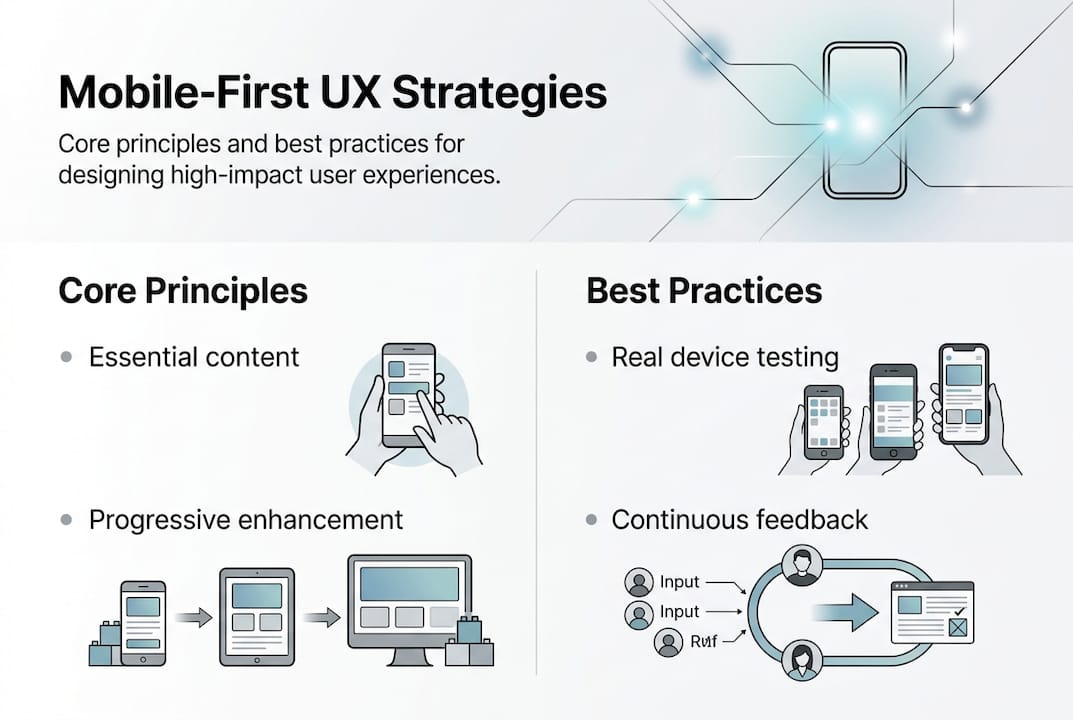
The core principles of a mobile-first design methodology include:
- Start small. Design for the smallest viewport first, typically 320px to 375px wide.
- Prioritize ruthlessly. Only include content and actions that serve the user's core need.
- Enhance progressively. Add complexity, layout options, and secondary features as screen size increases.
- Test on real devices. Emulators miss critical performance and touch interaction issues.
"Mobile-first is not about screen size. It is about forcing the team to decide what actually matters." This is the mindset shift that separates teams who get mobile right from those who keep patching a broken experience.
The progressive enhancement model is especially powerful for growth-stage products. It keeps your core experience lean and fast, while giving desktop users the richer interface they expect. You are not building two products. You are building one product that scales intelligently.
The mobile-first design workflow: Methodologies and best practices
Knowing the philosophy is step one. Building it into your actual process is where most teams get stuck. Here is a practical workflow you can adapt for your product team.
The implementation methodology from BrowserStack outlines five core phases that map well to how growth-stage product teams actually work:
1. Content inventory and prioritization. List every piece of content and every action in your product. Then rank them by user need and business priority. If something does not make the top tier, it does not appear on mobile by default. 2. Wireframe for small screens first. Sketch or prototype at 375px before you touch desktop layouts. This forces layout decisions that are grounded in constraint, not convenience. 3. Write progressive CSS using min-width media queries. Your base styles target mobile. You add complexity as screen width grows. This is the opposite of how most teams write CSS, and it produces cleaner, faster stylesheets. 4. Test on real devices and slow networks. Use actual phones, not just browser dev tools. Test on 3G connections. Run Core Web Vitals audits. Emulators do not replicate real-world touch behavior or performance bottlenecks. 5. Build offline support and graceful degradation. Plan for connectivity gaps. If a user loses signal mid-task, what happens? A well-designed mobile experience handles that without crashing the flow.
Here is a quick reference for where each phase fits in a typical sprint cycle:
| Phase | Sprint activity | Owner |
|---|---|---|
| Content inventory | Discovery and planning | PM + UX lead |
| Mobile wireframes | Design sprint day 1 | UX designer |
| Progressive CSS | Development sprint | Frontend engineer |
| Real-device testing | QA and review | QA + UX |
| Offline and degradation | Final sprint review | Engineering + PM |
You can see how this maps to real team workflows in our mobile-first optimization case study, where a structured sprint approach led to measurable performance gains.
!Product manager illustrating mobile-first sprint cycle

Pro Tip: Budget at least one testing session per sprint specifically for slow-network and real-device testing. Most performance regressions are caught here first, not in browser emulators. A $30 budget device running on throttled 3G will expose more issues than an hour of desktop testing.
The implementation methodology is not a one-time process. It is a repeating loop. Each sprint should revisit mobile performance, not just new features.
Empirical results: How mobile-first improves UX and business metrics
Process matters, but numbers close the argument with stakeholders. The data on mobile-first design outcomes is hard to ignore.
According to verified benchmarks, mobile-first sites convert 23% more users, load 40% faster, and see 67% lower bounce rates compared to desktop-first responsive sites. Those are not marginal improvements. A 23% lift in conversions can be the difference between hitting your growth targets and missing them.
Here is what that looks like in practice across common product scenarios:
- Checkout flows. Streamlined mobile checkout with fewer fields and thumb-friendly tap targets consistently outperforms desktop-ported forms. Users abandon carts when forms feel awkward on a phone.
- Onboarding screens. Mobile-first onboarding that surfaces one action per screen reduces cognitive load and improves feature adoption rates.
- Form completion. Shorter, prioritized forms designed for mobile first see higher completion rates because they respect the user's context and attention.
- Speed. If your mobile page takes more than 3 seconds to load, a significant portion of users leave before it finishes. Speed is not a nice-to-have. It is a conversion variable.
The business case for investing in UX case studies and mobile-first redesigns is well-supported across industries. E-commerce, SaaS, and fintech products all show consistent improvement when mobile is treated as the primary design surface.
Pro Tip: When presenting mobile-first improvements to leadership, tie every UX change to a specific metric. Do not say "we improved the checkout flow." Say "we reduced checkout abandonment by 18% by removing three form fields and adding autofill support." Specificity wins budget.
You can review documented outcomes and methodology in our UI/UX case studies to see how these benchmarks translate into real product environments. The pattern is consistent: teams that invest in mobile-first design see compounding returns as their user base grows.
!Infographic on mobile-first user experience strategies
Mobile-first in practice: Alignment, testing, and continual improvement
Knowing the impact is one thing. Building a team culture that sustains mobile-first thinking over time is another challenge entirely.
The Figma resource library on mobile-first design emphasizes a point that resonates with every growth-stage PM we have worked with: align your mobile design priorities directly to business metrics. Do not design in a vacuum. Every mobile UX decision should connect back to a measurable outcome like conversion rate, session duration, or task completion rate.
Here is how to build that alignment into your team's workflow:
- Map mobile flows to business goals. Before any design sprint, identify which user flows drive your most important metrics. Start mobile-first improvements there.
- A/B test mobile experiences specifically. Do not run combined desktop and mobile tests. Segment your results. Mobile users behave differently, and pooled data hides what is actually happening on small screens.
- Use real user monitoring (RUM), not just analytics dashboards. RUM tools capture actual device performance, not simulated conditions. This tells you what your users are experiencing, not what your team assumes they are experiencing.
- Empower your team to say no. Mobile-first culture means giving designers and PMs the authority to push back on feature requests that do not serve mobile users well. This is harder than it sounds in fast-moving teams.
- Budget for ongoing device and network testing. This is not a one-time setup cost. It is a recurring line item that pays for itself in caught regressions.
Pro Tip: Review your design insights and analytics monthly with a mobile-only filter applied. You will often find that mobile users are dropping off at completely different points than desktop users. Fix those gaps before adding new features.
Building mobile-first into your product design services workflow is not a project. It is a practice. Teams that treat it as a permanent operating mode, rather than a one-time redesign initiative, consistently outperform those that do not.
Editorial perspective: Why embracing mobile-first forces better UX design
Here is the uncomfortable truth most design articles skip: mobile-first is not primarily a mobile strategy. It is a clarity strategy.
When you force a team to design for a 375px screen first, you are forcing them to answer a question that most product teams avoid: what does this product actually do for users? Every feature that cannot survive the mobile-first filter is a feature that probably should not exist at all, or at least not in its current form.
The teams we see struggle most with mobile-first are not struggling because of technical limitations. They are struggling because mobile-first exposes years of feature creep, unclear priorities, and design decisions that were made to satisfy internal stakeholders rather than actual users.
Mobile-first is a forcing function. It removes the safety net of extra screen space and makes every design decision visible. That is uncomfortable. It is also exactly why it produces better products.
Our UI/UX design insights consistently show that products built mobile-first have cleaner information architecture, faster load times, and higher user satisfaction scores, not just on mobile, but on desktop too. The constraint makes everything better.
Unlock high-performing mobile UX with Bitrupt Design
If you are leading a product team at a growth-stage tech company and mobile UX is not yet a structured priority, the gap between where you are and where you need to be is likely larger than it appears in your current analytics.
Bitrupt Design works with product managers and UX leads to build mobile-first experiences that connect directly to business outcomes. From structured design sprints to full product design services, we bring the methodology, the tools, and the track record. Browse our UI/UX case studies to see documented results, or start with the Global Trainer case study to see how mobile-first thinking drove measurable improvements for a real product team.
Frequently asked questions
What is the goal of mobile-first design?
The goal is to prioritize essential content and user actions on mobile devices first, then enhance the experience for larger screens. As the IxDF defines it, mobile-first design starts with the smallest screen and scales up.
How does mobile-first design impact business metrics?
Mobile-first sites deliver measurable gains across key metrics. Verified data shows 23% higher conversions and 67% lower bounce rates compared to desktop-first responsive sites.
What are the first steps for implementing mobile-first design?
Start with a content inventory, prioritize for mobile, wireframe at small screen sizes, and then test on real devices and slow networks before expanding to larger layouts.
Is mobile-first relevant for B2B SaaS products?
Absolutely. B2B users increasingly check dashboards, approve requests, and complete quick tasks on mobile. Mobile traffic now accounts for 60 to 72% of web sessions, and B2B products are not exempt from that shift.
What is progressive enhancement in mobile-first design?
Progressive enhancement means designing for mobile core features first, then layering in additional content and functionality for larger screens. The IxDF explains it as a deliberate scale-up approach rather than a scale-down compromise.